Abstract: Jodoo’s Dashboard offers a variety of chart options to transform raw data into meaningful insights. By selecting appropriate chart types, users can easily identify patterns, trends, and correlations, enabling informed decision-making and strategic planning.
Introduction
In the digital age, data plays a crucial role in informing our decisions, guiding our strategies, and giving us a competitive edge. However, raw data alone is like a diamond in the rough — it needs to be polished to reveal its true value. That’s where data visualization comes in, and that’s where Jodoo’s Dashboard shines.
Jodoo’s Dashboard is not just a mere feature; it’s a powerful tool that transforms your data into actionable insights. It provides a customizable space where you can add various components like charts and tables to visualize your data. This isn’t just about making your data look pretty; it’s about making your data work for you.

Data visualization is of paramount importance because it allows us to identify patterns, trends, and connections that might go unnoticed in text-based data. Transforming complex data sets into compelling visual narratives, facilitates effective decision-making. When it comes to data visualization, Dashboard stands out from the crowd.

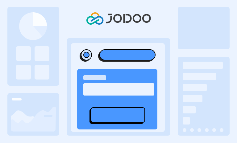
One of the standout features of Dashboard is its previewing capability. This allows you to see how the Dashboard will look on different devices, which ensures a seamless user experience across all platforms. Whether you’re in the office or on the go, you’ll have access to your data whenever and wherever you need it.
To effectively display data, choosing the right charts is essential. Jodoo’s Dashboard provides a diverse selection of chart types to make sure your data is presented in the most impactful way.
How to Effectively Display Data in the Dashboard?

Dashboard is designed to help you transform raw data into meaningful insights, and here’s how you can do it:
1. Identify Your Goals
Before you start, understand what you want to achieve with your dashboard. Are you tracking sales performance? Monitoring project progress? Understanding your goals will guide your choice of charts and data representation.
2. Choose the Right Charts
Dashboard offers a wide array of chart types. You can select data effects based on your desired goals: comparison, proportion, trend, distribution, or view details, etc.
3. Organize Your Dashboard
Arrange your charts and data logically and intuitively. The most important information should be at the top or in the center. Group related data together for easy comparison and analysis.
4. Keep It Simple
Avoid cluttering your dashboard with too much information. Stick to the most relevant data and keep your charts clean and easy to understand. Remember, the goal is to convey information quickly and clearly.
5. Use Real-Time Data
Jodoo allows you to use real-time data in dashboards to ensure your insights are always up-to-date. This is particularly useful for tracking progress towards goals or monitoring ongoing projects.
6. Customize Your Dashboard
Jodoo allows you to customize your dashboard to suit your needs. You can choose different themes, adjust the layout, and even control who has access to your dashboard and who can see which parts of the dashboard.
By following these steps, you can effectively display data in your dashboard with Jodoo, turning raw data into actionable insights that drive decision-making and strategy.
Choose The Right Charts For Your Data
With Jodoo, you have a wide array of chart types at your disposal, each designed to present your data in the most insightful way possible. Here’s a guide to help you make the right choice:
| Category | Explanation | Suitable Chart Types |
|---|---|---|
| Comparison | Some charts can show the order in which things are arranged — are they familiar, or A is more or less than B? | Column Chart, Combo Chart, Bar Chart, Radar Chart |
| Proportion | Some charts focus on each segment as a percentage of the total. | Pie Chart |
| Trend | Trend is one of the most common Time-Series relationships displaying how the data changes over time. | Line Chart, Area Chart |
| Aggregation | Some charts can summarize the statistics of the indicators of the data. | Indicator Chart, Pivot Chart |
| Distribution | Some charts can display how many items are included in each numerical range, typical information will include: “concentration”, “frequency”, “distribution”, etc. | Funnel Chart, Gantt Chart |
| Detail | Some charts can show the details of the data, and view and edit the detailed data situation of a single piece of data. | Detail Table, Spreadsheet, Calendar |
Types of Charts in the Dashboard
There is a detailed introduction to these 6 types of charts in the dashboard:
1. Comparison Charts
This type of chart is particularly useful when you want to show the order in which things are arranged or to illustrate whether one data point is more or less than another.
There are several types of comparison charts available in Jodoo, including:
Column Chart

- To compare data across categories using vertical bars.
- One axis represents the category being compared, while the other axis represents the corresponding scale value.
- Ideal for comparing a single category of data between individual sub-items, such as comparing the sales of different products in a store.
Combo Chart

- Display multiple formats on different axes for diverse data comparisons.
- Perfect for comparing and contrasting different types of information, like comparing sales volume and profit margin of a product over time.
Bar Chart

- To plot three or more quantitative variables, which are represented on axes starting from the same point.
- Great for comparing multiple variables to see which ones have similar values or if there are any outliers, such as comparing the skill sets of different employees in a company.
2. Proportion Chart
Proportion charts focus on displaying each segment as a percentage of the total, making them ideal for scenarios where you need to understand the distribution of a particular variable.
Pie Chart

- To visualize the relative proportions or percentages of multiple categories, with the whole pie representing the total data set and each slice representing a different category.
- Ideal for displaying the distribution of a categorical variable, such as the market share of different companies in an industry or the proportion of sales across different product categories.
3. Trend Charts
Trend charts are designed to provide a clear and intuitive understanding of trends and changes over time. They are particularly useful when you want to visualize data that changes continuously over a while and understand the overall direction of these changes. Here’s a summary of Jodoo‘s trend charts:
Line Chart

- To display trends over time, showing the progression of a single or multiple variables.
- Ideal for tracking changes over time, such as sales trends, website traffic, or stock market performance.
Area Chart

- To emphasize the degree of change over time, and to show the cumulative effect of these changes.
- Useful for showing trends in total over time, such as total sales, total website traffic, or total stock market value.
4. Aggregation Charts
They are particularly useful when you need to analyze large data sets and extract key insights quickly and efficiently. We can use the following charts for aggregation:
They are particularly useful when you need to analyze large data sets and extract key insights quickly and efficiently. We can use the following charts for aggregation:
Indicator Chart

- To sum over a single measure or according to multiple dimensions, providing a quick overview of key metrics.
- Ideal for Dashboard displays, where you need to monitor key performance indicators (KPIs) such as total sales, average order value, or customer satisfaction score.
Pivot Chart

- Interactive and capable of performing certain calculations like Sum and Count, providing a detailed breakdown of data.
- Useful for data analysis tasks where you need to summarize complex data sets, such as sales details of different products, customer segmentation, or performance metrics across different teams.
5. Distribution Charts
Distribution charts are designed to visually represent data distribution. They help users identify patterns, trends, and outliers. Charts used to represent these are listed below.
Funnel Chart

- One-way analysis in standardized business workflows.
- Effectively highlight problem areas, aiding decision-making.
- Find applications in sales for funnel analysis, marketing for SEO conversion analysis, and e-commerce for user path funnel analysis.
Gantt Chart

- Display the change of internal relationships of projects, progress, and other time-related systems as time changes.
- Used in project management to show when the plan will be carried out and to contrast between progress and request.
- Also used to analyze workflows and processing progress in workflow forms.
6. Details
Detail Table

- Display data in a structured and organized manner, allowing users to easily view, edit, and manage their data.
- Ideal for scenarios where users need to view and manage large amounts of data, such as inventory management, project management, and financial analysis.
Spreadsheet

- Display data in the style of a table, and users can edit, add, and delete data that are published to them.
- Default access for viewing and managing data is the same as that for the original data source, making it easier to manage data rights.
- Perfect for scenarios where users need to view, edit, and manage data in a tabular format, such as budget planning, project scheduling, and data analysis.
Calendar

- Used to display data in the form of a calendar, providing a visual representation of dates and times.
- Ideal for scenarios where users need to manage and track dates and times, such as event planning, project scheduling, and task management.
End Notes
With the powerful features of Jodoo’s Dashboard, you can explore data, discover trends and correlations, formulate strategic plans, and share insights with your team for better business outcomes. By selecting the appropriate chart types and data presentation methods, you can better understand and analyze your data, gaining valuable insights from dashboards. Whether you are a beginner or an experienced data analyst, Jodoo is an ideal choice to empower you in a data-driven world.


