
Introduction: Why Pareto Charts Matter in Manufacturing Quality
In most factories, the problem is not a lack of data. There are too many defect codes, too many downtime reasons, and too many rework issues competing for the same limited improvement time. Studies across operations and quality management often show that a small number of causes drive the majority of losses, which is exactly why the Pareto chart remains one of the most practical tools on the shop floor.
For a quality manager or plant leader, the value is simple: instead of debating 20 possible issues, you can see which few are creating most of the scrap, complaints, or production disruption. That is the real use of the 80/20 rule in manufacturing quality. It is not a rigid formula, but a way to focus corrective action where it will deliver the fastest operational payoff.
This article explains how a Pareto chart works, how to build one correctly from production data, and how to interpret it without falling into common analysis mistakes. You will also see how teams use Pareto analysis in manufacturing beyond defect counts, including downtime, rework, and supplier issues, so you can turn quality defect analysis into a clear improvement priority list.
What a Pareto Chart Shows and How the 80/20 Rule Works on the Shop Floor
The Two Parts of a Pareto Chart
A Pareto chart combines two views in one visual. The bars show how often each problem occurs, ordered from highest to lowest, while the line shows the cumulative share of total problems as you move from left to right. This layout makes it easy to see which few categories account for most of the loss, instead of treating every issue as equally important.
In manufacturing, the categories can represent defect types, scrap reasons, downtime causes, rework drivers, or even supplier nonconformances. A quality manager might use a defect Pareto chart to rank solder bridges, dimension failures, and packaging errors by frequency. A production manager might use the same logic to rank machine stoppages such as sensor faults, material jams, and changeover delays.
How Teams Find the “Vital Few”
The practical value of a Pareto chart is not the bars alone but the pattern they reveal. When the first three or four categories drive most of the total, you have identified the “vital few” causes that deserve immediate attention. The remaining categories still matter, but they usually do not deserve the same level of resources in the first improvement cycle.
This is where Pareto analysis in manufacturing becomes useful for daily decision-making. If one machining cell shows that burr defects, tool wear, and fixture misalignment account for 78% of nonconformances, the team has a clear starting point for quality defect analysis. Instead of launching six disconnected actions, they can focus maintenance, process checks, and operator retraining on the biggest contributors first.
What the 80/20 Rule Really Means in Manufacturing
The 80/20 rule in manufacturing is a prioritization principle, not a strict formula. In real factories, the pattern may be 70/30, 85/15, or 65/20 depending on the process, product mix, and data quality. The point is not to force the numbers to equal 80 and 20, but to identify the small number of causes creating a disproportionate share of the impact.
That distinction matters on the shop floor. For example, a stamping plant may find that two scrap causes generate 68% of total scrap cost, while in an assembly line, four defect categories may create 82% of all rework tickets. Both are valid Pareto chart examples because the chart is helping the team rank what to fix first, not proving a mathematical law.
Where Pareto Analysis Fits in Factory Operations
Pareto analysis is often associated with defects, but its use is much broader. In downtime analysis, the bars may represent breakdown causes, and the cumulative line shows which stoppages are consuming the most available production time. In rework analysis, the chart may reveal that a small number of recurring assembly errors are driving most labor hours spent on correction.
For plant leaders, this makes the Pareto chart useful across multiple review routines. It can support weekly quality meetings, daily production loss reviews, supplier performance discussions, and continuous improvement projects. When the same logic is applied consistently, teams can compare priorities by line, shift, product family, or time period before those insights are rolled into a broader manufacturing quality dashboard.
What a Pareto Chart Does Not Tell You
A Pareto chart shows concentration, not root cause. It tells you where the largest problems sit, but not why they happen or which corrective action will work best. That is why high-performing teams use it as a screening tool before moving into deeper analysis such as check sheets, 5 Whys, fishbone diagrams, or process verification.
It also does not measure severity unless you build the categories around impact rather than simple counts. A low-frequency defect with high customer risk can still deserve urgent action, even if it appears on the right side of the chart. In practice, the chart helps you prioritize the first conversation; it does not replace engineering judgment.
Pareto Chart Example: How to Build One for Defect Analysis
Step 1: Collect Defect Data From One Stable Process Window
Use one consistent production scenario so the numbers mean something. For example, assume an electronics assembly line records all final inspection defects for 1,000 PCB units over one week on Line 3. The team logs each defect against a standard reason code: solder bridge, missing component, wrong label, cosmetic scratch, and bent pin.
The key at this stage is Konsistenz, not complexity. If one inspector writes “bad solder” and another writes “solder short,” your quality defect analysis will split the same issue into two smaller categories and weaken the result. A simple check sheet or digital inspection form is usually enough, as long as every defect is captured the same way.
Step 2: Define Clear Defect Categories Before Counting
For a defect Pareto chart, categories should describe the defect type, not the suspected cause. In this example, “missing component” is a valid category, but “operator error” is not, because it jumps ahead to root cause before the team has verified anything. Keep the categories observable and mutually exclusive so inspectors can classify defects quickly on the shop floor.
After one week, the team has the following raw counts: solder bridge 38, missing component 27, wrong label 14, cosmetic scratch 11, and bent pin 10. That gives a total of 100 defects, which makes the percentage calculation easy, but the same method works with any total. This is the practical base for Pareto analysis in manufacturing: count first, investigate second.
Step 3: Sort the Data and Calculate Cumulative Percentage
Now sort the categories from highest to lowest frequency. In this case, the order already runs from 38, 27, 14, 11, to 10, so the next step is to convert each count into a share of total defects and then build the cumulative percentage line. The cumulative values become 38%, 65%, 79%, 90%, Und 100%.
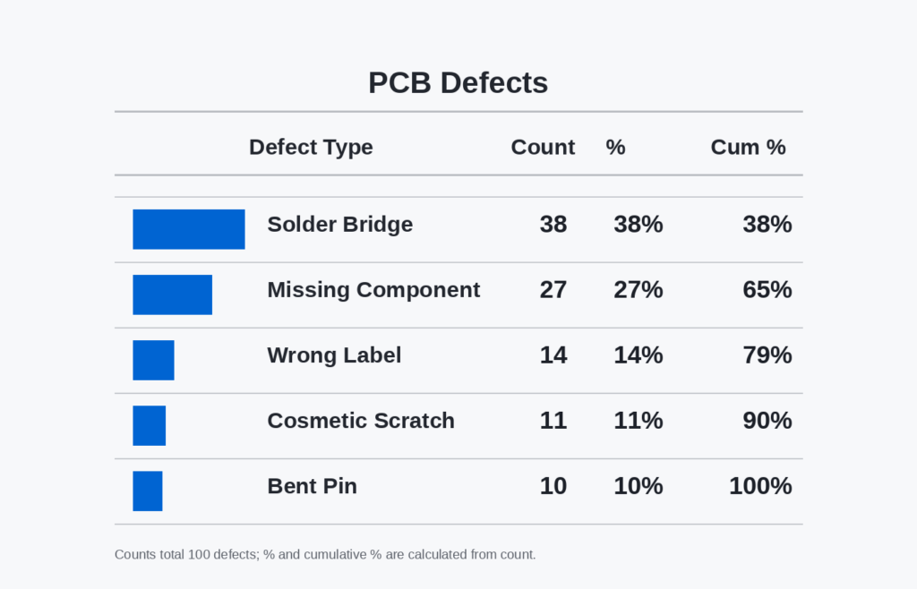
This sorted view is where the 80/20 rule in manufacturing becomes operational. You can already see that the first two categories account for 65% of all recorded defects, and the first three account for 79%, which is close enough to identify the “vital few” for immediate action. The exact split will vary, but the logic stays the same: focus on the few categories creating most of the quality loss.
Step 4: Plot the Defect Pareto Chart Correctly
Create a bar chart with the defect categories on the horizontal axis and the defect counts on the left vertical axis. Then add a cumulative percentage line using the right vertical axis, scaled from 0% to 100%. The bars should stay in descending order, because that visual ranking is what makes the chart useful for prioritization.
If you build the chart in Excel, Google Sheets, or a manufacturing-quality dashboard, use a combo chart format rather than two separate visuals. That lets the team read both the defect volume and the cumulative contribution in one view. A clean chart should show, at a glance, where improvement effort will have the highest return.
Step 5: Check Whether the Data Is Good Enough to Act On
Before you present the chart to production or engineering, do one quick validation pass. Confirm that all counts come from the same inspection point, the same time period, and the same defect coding standard. If the data mixes incoming inspection, in-process checks, and final QC, the chart may still look accurate but lead to the wrong action.
For this electronics line, the result is strong enough to support the next step in decision-making. The team now knows that solder bridges and missing components dominate the defect pattern, so improvement work should start there rather than on lower-frequency issues like scratches or bent pins. The chart does not solve the problem by itself, but it gives the team a disciplined starting point for defect reduction.
How to Interpret a Defect Pareto Chart and Avoid Common Analysis Mistakes
Where to Draw the Cutoff and What to Fix First
A defect Pareto chart becomes useful only when you turn it into a decision. In most factories, the practical cutoff is where the cumulative line reaches roughly 70% to 80% of total defects, because that usually identifies the few categories driving most quality loss. This is the core logic behind the 80/20 rule in manufacturing: not every defect deserves the same level of attention at the same time. Your first action list should come from the “vital few” bars to the left of that cutoff, not from the full list of problems.
That said, the highest-frequency defect is not automatically the first issue to attack. In quality defect analysis, you also need to ask whether that defect is easy to contain, expensive to fix downstream, or likely to trigger customer complaints. A category responsible for 18% of defects may deserve priority over one at 22% if it causes warranty returns, line stoppages, or safety risk. Good Pareto analysis in manufacturing combines count data with operational impact, not count data alone.
Link Frequency to Cost, Risk, and Flow
A strong reading of a defect Pareto chart connects frequency with business consequences. For example, an automotive supplier may find that minor surface scratches are the most common defect, but torque-related assembly errors create the highest rework hours and customer risk. In that case, the chart still helps prioritize, but the decision must include severity, containment cost, and escape risk. This is where many teams move from a basic Pareto chart example to a useful management tool.
One practical method is to review the top categories against three filters: defect count, cost of poor quality, and process disruption. A machining plant might see burrs at the top of the chart, but oversize dimensions may be the bigger issue because they scrap high-value parts and consume machine capacity. If two categories are close in frequency, choose the one with the larger financial or delivery impact first. This keeps the chart aligned with plant performance, not just inspection totals.
Compare a Good Chart With a Misleading One
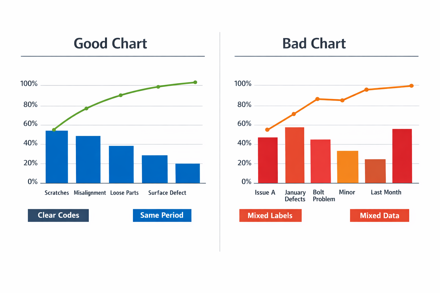
A well-structured Pareto chart uses clear, non-overlapping defect categories, a defined time window, and a consistent counting method across shifts or lines. A misleading chart mixes broad labels like “assembly issue” with narrow labels like “loose screw” or combines defects collected over different periods and sample sizes. The result is a chart that looks analytical but cannot support sound action. If the underlying categories are weak, the visual ranking will be weak too.
Common Mistakes That Distort Interpretation
Inconsistent reason codes are one of the most common failures. In discrete assembly, one operator may log “wrong label,” another uses “label mismatch,” and a third selects “printing issue,” even when the same problem is occurring. This splits one defect family into several smaller bars and hides the real priority. Before trusting the chart, make sure the defect taxonomy is standardized at the point of data entry.
Another mistake is mixing severity with frequency in the same chart. In automotive production, a rare brake-related defect and a frequent cosmetic defect should not be merged into one ranking without context, because they answer different questions. Frequency tells you where defects happen most often, while severity tells you where risk is highest. If both matter, use the Pareto chart for frequency and review severity in a separate layer, such as an FMEA score or escalation matrix.
Stale data also creates false priorities. A machining cell may still be working from last quarter’s defect Pareto, even though a tool change and fixture redesign already removed the old top cause. If the data window is too old, your team may launch corrective action on a problem that is no longer dominant. For fast-changing processes, weekly or even daily refresh cycles are often more useful than monthly static reviews.
Small samples can be equally dangerous. If a new model launch generates only 25 total defects in its first few days, the tallest bar may reflect normal startup variation rather than a stable pattern. In that case, use the chart as an early signal, not as proof of a long-term issue. A good rule is to check whether the sample size and collection period are large enough to represent normal production conditions.
Turn Interpretation Into Action
Once you identify the top defect category, define one owner, one containment action, and one root-cause path. Do not launch five improvement projects because the chart shows five bars on the left side; most plants get better results by closing one major issue, then rebuilding the chart with fresh data. That discipline prevents teams from spreading engineering time too thin. It also makes the next Pareto review easier to connect with actual gains in scrap, rework, or first-pass yield.
As the data matures, many factories track these priorities in a manufacturing quality dashboard so they can compare shifts, lines, or product families without rebuilding the analysis manually. The dashboard does not replace interpretation, but it helps managers see whether the same top category is persistent, localized, or already improving. That is when a Pareto chart stops being a reporting slide and starts becoming a control tool.
Using Pareto Analysis in Manufacturing Beyond Defects
A Pareto chart is most useful when you stop treating it as a defect-only tool. In practice, Pareto analysis in manufacturing helps different leaders rank the few loss categories that create most of the plant’s operational drag, whether that drag appears as downtime, scrap, rework, supplier issues, or customer complaints. This is where the 80/20 rule in manufacturing becomes operational: not every category deserves the same attention, and not every chart should drive the same action.
For Production Managers: Rank Downtime Losses First
For a production manager, the most valuable Pareto view is often downtime by cause rather than defect count by type. A packaging line, for example, may show that jam clearance, changeover delays, and sensor faults account for 78% of lost minutes, even though operators report ten different stop reasons across the shift. That changes the response from “fix everything” to “stabilize the top three interruptions first.”
In this case, frequency alone is not enough, so the chart should use total downtime minutes as the measurement basis. A short stop that happens 40 times may still matter less than one recurring fault that consumes two hours per day. Pair the Pareto chart with a simple check sheet or machine stop log so that reason codes are captured consistently by line and shift.
For Lean Managers: Focus on Rework Drivers and Hidden Factory Loss
Lean managers often use Pareto analysis to expose the categories that consume labor without appearing clearly in finished scrap numbers. In an appliance assembly plant, a rework Pareto may show that door alignment correction, wiring reroute, and fastener retightening create most touch-up hours at final inspection. That is a stronger improvement signal than tracking only pass/fail counts.
This is also where a Pareto chart example based on labor hours can be more useful than a classic defect Pareto chart based on frequency. One rework category may occur less often but absorb far more technician time, line balancing effort, and overtime cost. When the objective is lean improvement, the best chart measures the resource being lost, not just the number of incidents.
For Process Engineers: Separate Scrap Causes From Symptom Categories
Process engineers need a Pareto view that helps isolate process instability, not just sort visible outcomes. In a metal stamping operation, “burr,” “distortion,” and “surface mark” may appear as top scrap categories, but those are still symptom labels. The next step is to connect the chart to process variables such as die wear, lubrication inconsistency, coil variation, or press alignment.
A Pareto chart should often be paired with root cause tools rather than used alone. A good sequence is check sheet → Pareto ranking → 5 Whys or fishbone analysis → trial and validation. Without that follow-through, the team may produce a clean chart but still fail to reduce scrap in a sustained way.
For Plant Managers: Prioritize Supplier and Complaint Categories
At the plant level, Pareto analysis becomes a cross-functional prioritization tool. A plant manager may review supplier nonconformances by incident cost, incoming defect quantity, or production disruption, while customer complaint categories may be ranked by return volume or claim value. The point is not to create one master chart for the whole site, but to compare which “vital few” categories are hurting performance in each part of the value chain.
A manufacturing quality dashboard makes this much easier because the same Pareto logic can be segmented by line, shift, product family, plant, or supplier. Instead of debating one static monthly report, managers can see whether carton crush is concentrated on one packing line, whether cosmetic complaints are tied to one product family, or whether incoming dimension failures come from a specific vendor lot pattern.
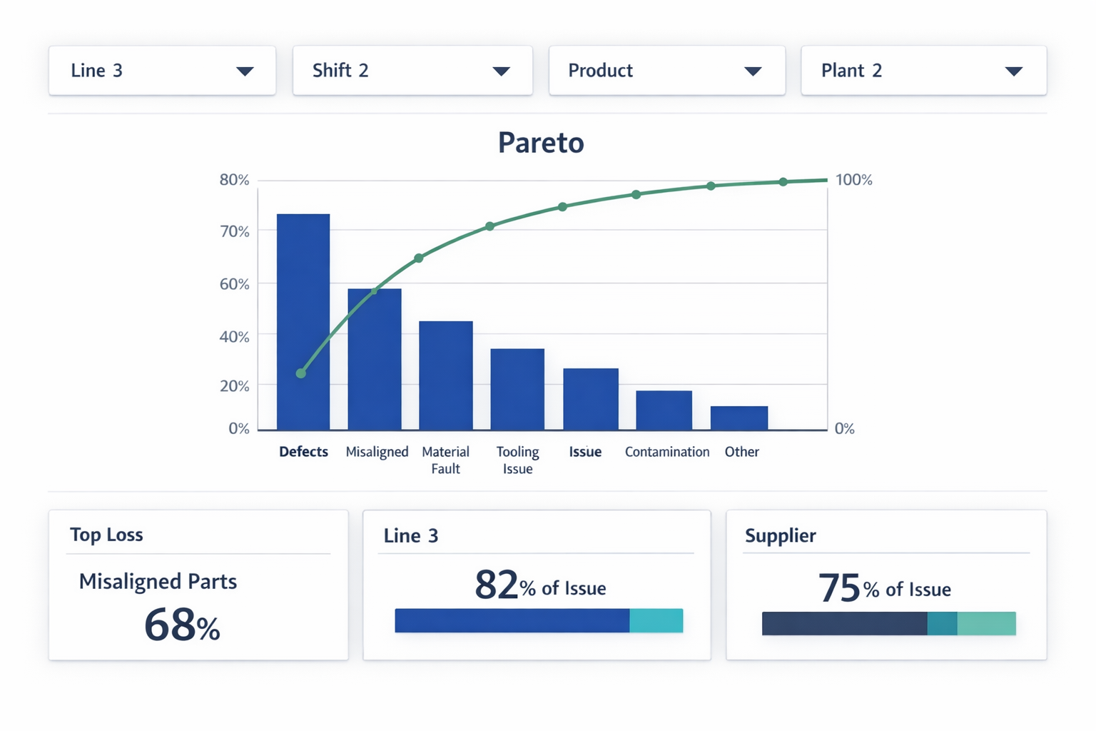
This segmented view is especially important in multi-line or multi-site operations. A blended chart can hide local concentration and make the wrong problem look bigger than it is. When teams use a dashboard to filter Pareto results dynamically, they move faster from ranking to action.
When to Pair a Pareto Chart With Other Tools
Use a Pareto chart when you need to decide where to start, but do not expect it to tell you why the problem exists or how to control it. For recurring quality defect analysis, downtime review, or complaint triage, it works best as the prioritization layer above structured data capture. Once the top categories are clear, teams should move into the right follow-up tool based on the problem type.
If the issue is inconsistent reporting, start with a check sheet and tighter category definitions. If the issue is process instability, use root cause analysis and process validation. If the issue spans lines, products, or suppliers, connect the chart to a manufacturing quality dashboard so leaders can compare patterns in real time instead of relying on one static defect Pareto chart.
Conclusion: Turn Pareto Insights Into Action
A Pareto chart helps your team stop chasing every issue at once and focus on the few causes creating most of the quality loss. That matters in real plants, where engineering time, supervisor attention, and corrective action budgets are always limited. But the chart itself is only the starting point. If defect data is delayed, categories are inconsistent, or actions are not tracked, even a good Pareto analysis will not lead to sustained improvement.
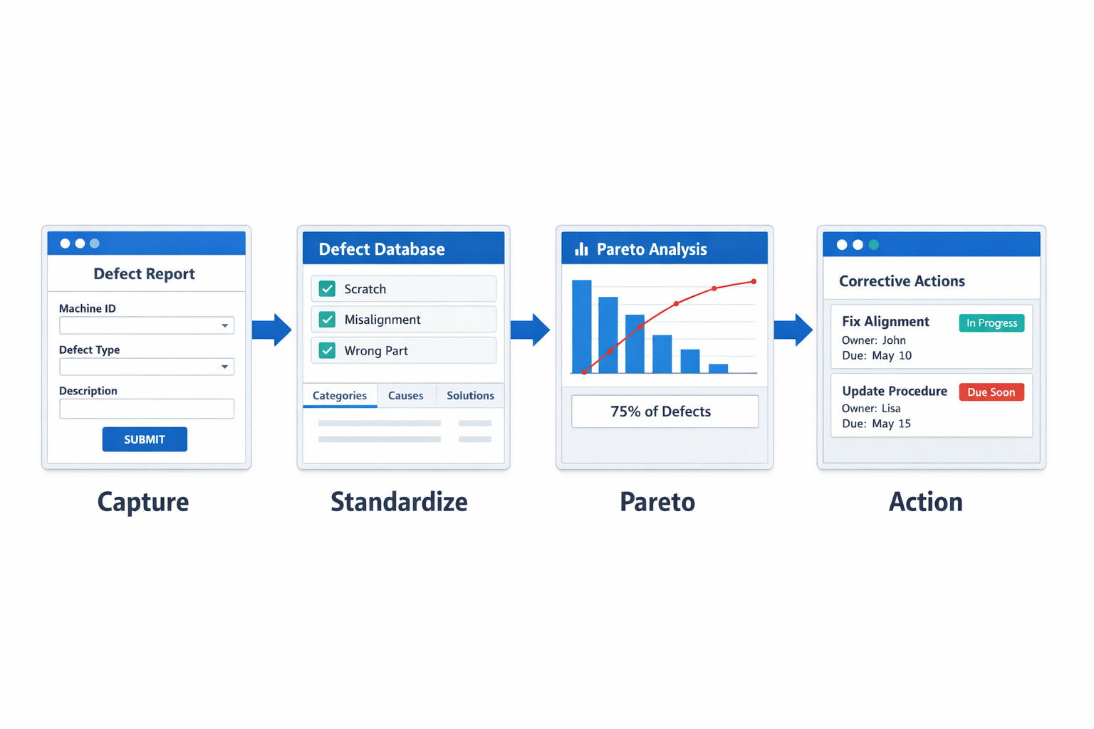
Jodoo helps manufacturers move from manual analysis to a connected quality workflow. Teams can use no-code forms to capture defects at the line, standardize defect categories across shifts and products, and automatically feed that data into live Pareto reports and manufacturing quality dashboards. From there, you can trigger corrective action workflows, assign owners, set due dates, and monitor closure status in one system.
If you want to turn Pareto insights into faster shop-floor action, Jodoo is a practical no-code platform for lean manufacturing teams. You can Kostenlose Testversion starten oder Demo buchen to see how it fits your quality process.