Browse by category
Introduction: Why a Manufacturing KPI Dashboard Matters More Than Ever
A plant can lose 5% to 20% of its productive capacity through downtime, minor stops, speed loss, and quality losses, yet many factories still rely on yesterday’s spreadsheet or end-of-shift report to understand what happened. That delay is costly. In a high-mix electronics plant or an automotive parts facility running tight customer schedules, even a 30-minute blind spot can mean missed output targets, premium freight, or overtime that erodes margin. That is why a manufacturing KPI dashboard has become essential for plant managers, operations directors, and production managers who need faster, more confident decisions.
Imagine a production manager at a food manufacturing plant who sees scrap rising on one packaging line but only learns the full impact in the next morning’s meeting. By then, the waste, rework, and schedule disruption have already spread downstream. A real-time dashboard changes that by turning live shop-floor data into visible signals your team can act on immediately.
In this article, you will learn what to track, how to build a production KPI dashboard, and what to look for in manufacturing metrics dashboard software. The goal is simple: give you a practical way to improve visibility, reduce downtime, and manage performance in real time.
What Is a Manufacturing KPI Dashboard and What Should It Track?
A manufacturing KPI dashboard is a visual system that brings your most important plant data into one place so supervisors, production managers, and operations directors can see performance at a glance. It is not just a screen full of numbers. A good dashboard helps you spot exceptions, understand root causes faster, and decide what action to take during the shift, at daily review, or in weekly operations meetings.
Before defining the dashboard itself, it helps to separate metrics from KPIs. Metrics are any measurements you collect, such as cycle time, downtime minutes, scrap pieces, changeover duration, or energy consumption per line. KPIs are the few measurements tied directly to business performance and operational goals, such as OEE, first pass yield, on-time delivery, maintenance compliance, or inventory accuracy. In simple terms, all KPIs are metrics, but not all metrics deserve a place on your executive or shop floor dashboard.
This distinction matters because many factories already collect a lot of data but still struggle with visibility. Imagine a production manager at an automotive parts plant who receives one Excel file from production, another from maintenance, and a separate quality report at the end of the day. By the time the team compares machine downtime, scrap rate, and missed output against the plan, the shift is over and the corrective action is late. A manufacturing KPI dashboard turns that disconnected reporting into a live view of what is happening now and what needs attention first.
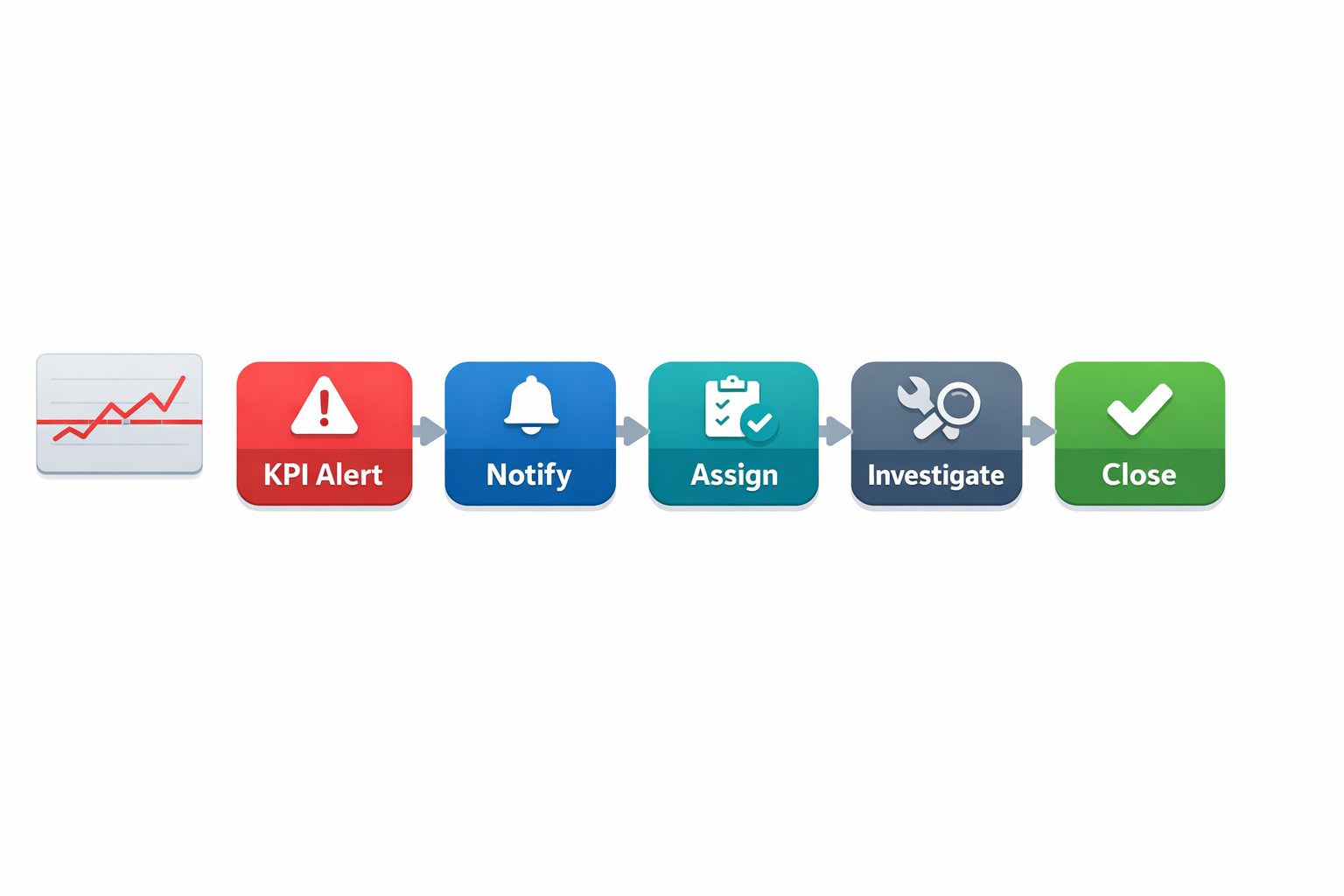
How a Manufacturing KPI Dashboard Turns Data Into Action
A strong dashboard does more than display totals. It connects planned output, actual production, machine status, quality results, labor performance, and material flow so the team can understand relationships between problems. If availability drops on one critical press, and the same line also shows rising scrap and late order completion, the dashboard should make that link obvious instead of forcing someone to investigate across five files.
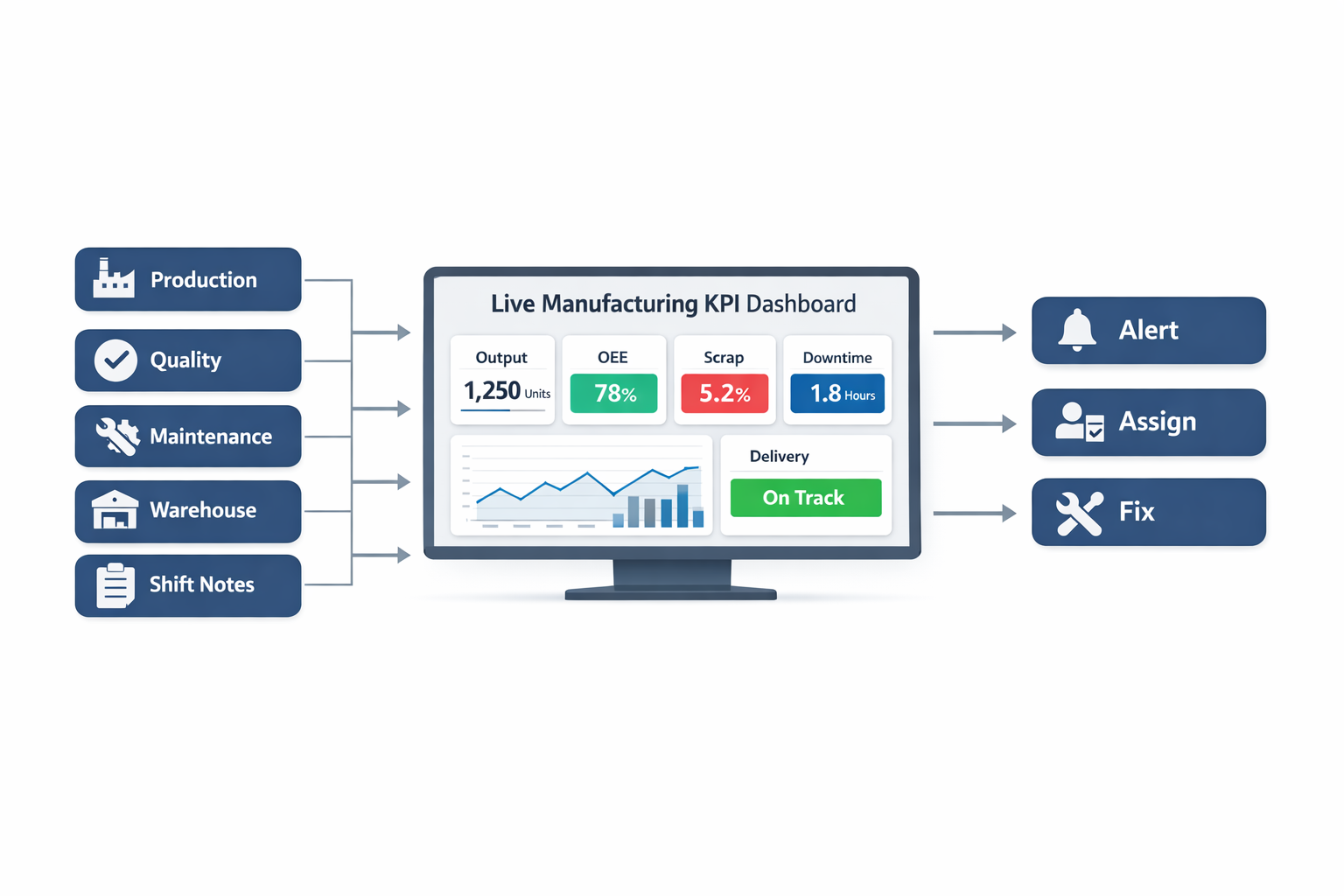
That is why many plants now move from spreadsheets to manufacturing metrics dashboard software. Digital dashboards can pull data from production forms, machine counters, maintenance logs, quality inspections, warehouse records, and even shift handover reports into a single view. This gives plant leaders a practical factory performance dashboard they can review by line, shift, product family, or site, rather than waiting for manual consolidation.
In lean environments, visibility is especially important because speed of response matters as much as accuracy of reporting. If your dashboard only tells you that yesterday was bad, it supports reporting. If it shows that Line 3 is currently running at 62% of target, scrap has crossed the control threshold, and a maintenance work order is still open, it supports action. That is where lean KPI tracking becomes useful: it helps teams identify abnormal conditions quickly and close the loop on corrective action.
Production KPIs
Production KPIs are usually the first thing people expect in a production KPI dashboard because they show whether the factory is making what it planned to make. Common measures include planned vs. actual output, attainment to schedule, cycle time, throughput, labor productivity, and changeover time. These KPIs tell you whether the line is running fast enough, often enough, and close enough to plan to support customer demand.
For example, an electronics assembly plant may track target units per hour, actual units produced, line stoppage minutes, and setup time between product models. If actual output is only 85% of plan for three consecutive shifts, the dashboard should help the team see whether the gap came from microstops, excessive changeovers, operator shortages, or component shortages. This kind of visibility is much more useful than simply knowing that “production was low.”
A widely used production KPI is Overall Equipment Effectiveness, which is why many factories build an OEE dashboard as a core part of their reporting. OEE combines availability, performance, and quality into one measure, making it easier to identify where equipment losses occur. According to industry benchmarks, world-class OEE is often cited at around 85%, while many factories operate closer to 60% to 70%, which means there is usually significant hidden capacity to recover before investing in new machines.
Quality KPIs
Quality KPIs show whether output is saleable, compliant, and consistent. The most common ones include first pass yield, defect rate, scrap rate, rework rate, customer complaints, and cost of poor quality. In regulated or certification-driven environments, you may also want audit findings, CAPA closure rate, and nonconformance trends visible on the same dashboard.
Consider a food manufacturing plant filling bottled beverages across multiple SKUs. If the line meets its output target but first pass yield drops because of fill-volume variation or cap seal defects, the apparent production success is misleading. A strong manufacturing KPI dashboard prevents this blind spot by showing production and quality together, so the team does not celebrate output that later turns into rework, quarantine stock, or customer claims.
Quality visibility is also essential for continuous improvement teams trying to sustain gains after a Kaizen event. If defect rates improve for one week and then drift back to baseline, the dashboard should make that regression visible by line, shift, and product. That is one reason effective lean KPI tracking often includes trend charts and threshold alerts, not just static summary tiles.
Maintenance KPIs
Maintenance performance has a direct effect on uptime, output stability, and operating cost. Core maintenance KPIs include unplanned downtime, planned maintenance completion rate, mean time between failures, mean time to repair, maintenance backlog, and spare parts availability. If these numbers are invisible, many plants end up treating maintenance as a support function instead of a major driver of plant performance.
Imagine a metal stamping plant where one press accounts for 30% of output on a high-volume customer program. If that machine fails repeatedly and repair time keeps increasing, production, delivery, overtime cost, and scrap can all deteriorate together. A dashboard that shows downtime by asset, recurring failure modes, and overdue preventive maintenance tasks helps operations and maintenance teams act earlier, not just argue later about who owns the problem.
This is also where an OEE dashboard becomes more valuable when paired with maintenance KPIs. OEE can tell you availability is falling, but maintenance KPIs explain why. When both are visible in the same factory performance dashboard, teams can connect loss categories to actual work orders, root cause analysis, and preventive action.
Delivery KPIs
Delivery KPIs measure how well the factory converts internal performance into customer service. The most common include on-time delivery, schedule adherence, order lead time, dispatch accuracy, and backlog status. These are critical because strong output numbers mean little if finished goods are late, incomplete, or not aligned with the customer schedule.
In automotive supply, for instance, a Tier 1 supplier may meet weekly volume targets overall but still miss delivery windows on one fast-moving part number because of unstable production sequencing. A dashboard that only shows total plant output will hide that risk. A better production KPI dashboard links production attainment to order-level shipment status so planners and plant managers can see whether the factory is building the right products at the right time.
Delivery KPIs are especially useful for sales and operations planning reviews, but they should not be limited to management meetings. Shift leaders also benefit from seeing which work orders are at risk during the day. When the dashboard flags a late order before the truck arrival time, the plant still has a chance to resequence, expedite inspection, or allocate labor to recover.
Cost KPIs
Cost KPIs help operations leaders understand whether the factory is improving output efficiently or simply spending more to protect service levels. Useful measures include conversion cost per unit, overtime cost, labor cost variance, scrap cost, rework cost, maintenance cost, and energy cost per unit. These indicators are essential because plant performance often looks good until finance translates operational waste into dollars.
For example, a plant may hit monthly shipment targets by running weekend overtime and absorbing extra scrap during changeovers. On paper, delivery looks healthy, but the cost picture tells a different story. A well-designed manufacturing KPI dashboard should make those trade-offs visible so management can ask better questions, such as whether recurring overtime is covering a scheduling issue, a staffing issue, or a chronic bottleneck.
Cost KPIs are also important for proving the value of continuous improvement. If a Kaizen project reduces average changeover time from 45 minutes to 28 minutes, the improvement should not stop at the time result. The dashboard should connect that gain to more available production hours, lower overtime, and improved asset utilization so the financial impact is visible.
Inventory KPIs
Inventory metrics are often overlooked in plant dashboards, but they are central to production stability and cash flow. Common KPIs include raw material stock days, work-in-process levels, finished goods inventory, stock accuracy, stockout frequency, inventory turnover, and slow-moving or obsolete stock. These measures help teams see whether materials are flowing smoothly or whether excess and shortage are building at the same time.
An electronics manufacturer, for example, may have enough total inventory on hand but still lose hours of production because one critical connector is missing at the line. Without inventory visibility, the team may blame production execution when the real issue is material availability or inaccurate stock records. A connected manufacturing metrics dashboard software setup can pull warehouse, line-side replenishment, and production consumption data together so shortages and excess become visible earlier.
Inventory KPIs also support lean goals. High WIP often hides process instability, long changeovers, or poor scheduling discipline, while frequent stockouts can indicate weak planning or supplier variability. Good lean KPI tracking therefore includes inventory signals alongside output and quality, not in a separate report that nobody checks until month-end.
What Should Appear on the Dashboard First?
Not every metric belongs on the main screen. For most plants, the top level of a manufacturing KPI dashboard should focus on a short list of decision-driving KPIs: output vs. plan, OEE, first pass yield, unplanned downtime, on-time delivery, scrap cost, and inventory status for critical materials. These measures give leaders a fast view of safety, flow, quality, asset reliability, service, and cost.
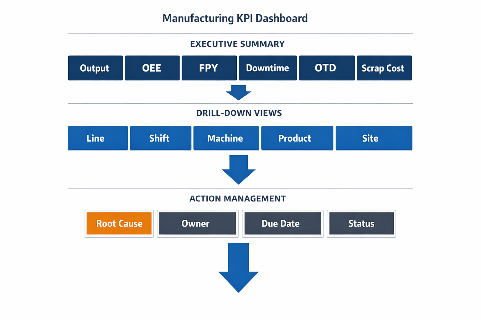
From there, users should be able to drill into details by line, shift, machine, product, or site. That structure keeps the dashboard simple enough for daily management while still supporting problem solving. In practice, the best dashboards work like a visual escalation system: summary first, root-cause detail second, action tracking third.
The key point is that a manufacturing KPI dashboard should not be built around what data is easiest to collect. It should be built around what decisions your team needs to make every day. When production, quality, maintenance, delivery, cost, and inventory KPIs are connected in one live factory performance dashboard, the result is not just better reporting. It is faster response, better alignment across departments, and a stronger foundation for continuous improvement.
The Most Important KPIs for a Production KPI Dashboard
A strong manufacturing KPI dashboard should do more than display numbers. It should help plant leaders see whether the factory is producing the right volume, at the right quality, at the right cost, and on time. In practice, that means combining operational, quality, delivery, and cost metrics into one view instead of forcing supervisors to pull data from whiteboards, spreadsheets, MES screens, and email reports. When you structure the dashboard well, it becomes a practical decision tool for shift leaders, production managers, plant managers, and operations directors.
The most effective production KPI dashboard usually starts with a small set of core measures that reflect daily factory performance. These KPIs should be updated frequently, clearly tied to plant targets, and easy to trace back to root causes when performance slips. For example, if throughput drops, the dashboard should help you quickly see whether the issue is downtime, slower cycle time, lower yield, or material shortages. That is the difference between reporting and real lean KPI tracking.
OEE: The Core Metric on an OEE Dashboard
Overall Equipment Effectiveness (OEE) is often the anchor metric on an OEE dashboard because it summarizes how well a line or machine is actually performing compared to its full potential. OEE combines three factors: availability, performance, and quality. World-class OEE is often cited at around 85%, but many factories operate closer to 60% to 70%, especially when data collection is still manual or inconsistent. That gap matters because even a 5-point improvement in OEE can translate into major capacity gains without buying new equipment.
On a factory performance dashboard, OEE is best placed near the top as an executive summary metric, with the three components directly underneath it. This lets a plant manager see immediately whether low OEE is driven by breakdowns, slow running speed, or quality losses. Imagine a production manager at an automotive parts plant who sees OEE fall from 72% to 64% on one stamping line. If the dashboard shows stable quality but a sharp drop in availability, the team knows to focus on downtime causes rather than operator speed or scrap reduction.
Different roles use OEE differently. A line supervisor may focus on shift-by-shift losses and short stops, while an operations director may compare OEE across plants or production cells. For CI and lean teams, OEE is valuable because it links directly to waste reduction, especially in waiting, defects, and underused equipment capacity. That is why OEE remains one of the first KPIs most manufacturers add when building a manufacturing metrics dashboard software setup.
Throughput and Cycle Time: Measuring Flow
Throughput tells you how many good units a line, cell, or plant produces over a specific period. It is one of the clearest ways to understand whether output matches customer demand and production planning assumptions. In a high-mix electronics factory, throughput may be tracked by line, model family, and shift, while in a food processing plant it may be monitored by kilograms, cartons, or batches per hour. On a dashboard, throughput is usually shown as actual versus target, with trend lines by shift, day, or week.
Cycle time measures how long it takes to complete one production cycle or one unit at a process step. This KPI is critical because even small increases in cycle time can create bottlenecks, reduce line balance, and affect delivery performance. For example, if a packaging line in a food manufacturing plant is designed to run at 40 packs per minute but slows to 34 packs per minute, daily output can fall significantly even without major downtime. A good production KPI dashboard should display cycle time close to throughput so teams can quickly connect slower flow with lower output.
For supervisors, throughput and cycle time are daily control metrics. For industrial engineers and CI teams, they are also diagnostic tools for line balancing, takt compliance, and bottleneck analysis. In lean environments, these KPIs help identify whether process improvements are actually reducing waiting time and improving flow. That makes them essential to practical lean KPI tracking, not just production reporting.
Downtime: The Hidden Capacity Killer
Downtime deserves its own place on a manufacturing KPI dashboard because it directly reduces available production time and often drives poor OEE. This KPI should not only show total downtime minutes but also classify downtime by reason, such as mechanical failure, changeover, material shortage, quality hold, or operator waiting. According to industry studies, unplanned downtime can cost manufacturers thousands of dollars per hour, with the impact especially severe in automotive and electronics plants running expensive, high-utilization equipment. If downtime is only shown as one total number, managers lose the ability to act.
On a strong factory performance dashboard, downtime should be visualized in two ways: total minutes and top causes. A Pareto chart is especially useful because it quickly highlights where most lost time is coming from. Imagine an electronics assembly plant where SMT Line 3 shows 180 minutes of downtime in one shift. If the Pareto view shows that 70 minutes came from feeder setup errors and 55 minutes from component shortages, the plant can split corrective action between engineering and materials instead of blaming maintenance alone.
Different roles prioritize downtime differently. Maintenance managers care about repeat failure modes and MTTR, while production managers care about the immediate effect on output and schedule adherence. Plant leadership looks at downtime as unused capacity that can often be recovered faster than investing in a new line. For that reason, downtime is one of the most actionable metrics in any manufacturing metrics dashboard software implementation.
Scrap Rate and First Pass Yield: Quality at the Source
Scrap rate measures the percentage of material or units that cannot be sold or used because of defects. In sectors with thin margins or high raw material costs, this KPI has a direct effect on profitability. In food manufacturing, scrap may come from fill weight errors, damaged packaging, or expired WIP. In electronics, scrap can result from solder defects, component damage, or PCB handling issues, each of which carries both material and labor loss.
First Pass Yield (FPY) measures the percentage of units that pass a process without rework or repair. This is especially important because rework often hides true process instability. A line can appear to hit output targets while still consuming extra labor hours, creating queues, and increasing late delivery risk. On a production KPI dashboard, FPY should sit next to scrap and defect trends so the team can see both the visible waste and the hidden waste.
The value of these metrics becomes clear in real factory scenarios. Imagine a manufacturer producing plastic interior components for the automotive sector. Output may look healthy on paper, but if FPY falls from 96% to 91%, operators and quality inspectors will spend more time sorting and reworking parts, which then reduces labor availability for the next batch. For quality managers, FPY is often more useful than final reject rate because it shows whether quality is being built into the process rather than inspected in at the end.
On-Time Delivery: Connecting the Shop Floor to the Customer
On-time delivery (OTD) shows whether production performance is supporting customer commitments. Many factories focus heavily on internal efficiency metrics but miss the fact that customers judge performance by whether shipments arrive complete and on schedule. OTD is often calculated as the percentage of orders shipped on or before the promised date, and in many industries the expected level is 95% or higher. When OTD drops, the problem is usually not just scheduling; it often reflects issues in throughput, changeover discipline, downtime, or quality losses.
In a factory performance dashboard, OTD should be placed in a section that links production to business performance. It works best when paired with schedule attainment or planned-versus-actual output, so operations leaders can tell whether missed shipments are caused by poor planning or poor execution. For example, a Tier 1 automotive supplier may run a line at acceptable OEE but still miss OTD because frequent model changeovers disrupt the dispatch schedule. In that case, the dashboard should push attention toward sequencing and planning discipline, not just machine performance.
Plant managers and operations directors usually prioritize OTD highly because it affects customer satisfaction, penalties, premium freight, and long-term business retention. Line supervisors may see it as a downstream metric, but they should still understand how shift losses contribute to missed shipments. This is why a well-designed manufacturing KPI dashboard should connect floor-level losses to customer-facing outcomes.
Capacity Utilization: Are You Using What You Already Have?
Capacity utilization measures how much of your available production capacity is actually being used. This KPI is important for deciding whether you need overtime, another shift, subcontracting, or capital investment. In many cases, manufacturers assume they need more equipment when the real problem is unstable execution on existing lines. A utilization rate that is too low may suggest idle assets, while a rate that is too high can signal an overloaded plant with rising risk of delays, breakdowns, and quality problems.
On an OEE dashboard or wider production KPI dashboard, capacity utilization usually sits at the plant or line-summary level rather than the machine-detail level. It should be compared with demand forecasts, labor plans, and actual output to support medium-term decision-making. Imagine a food manufacturer approaching peak seasonal demand. If dashboard data shows one filling line running at 92% utilization for several weeks while another similar line remains at 68%, managers can rebalance production before approving overtime or capex.
Operations directors tend to use this KPI for network and investment decisions, while plant managers use it for labor and shift planning. CI teams also use it to demonstrate that process improvements have unlocked capacity without additional equipment spend. That makes capacity utilization one of the most strategic metrics on a factory performance dashboard.
Cost Per Unit: Turning Operational Losses Into Financial Impact
Cost per unit translates production performance into financial terms that finance teams and senior leadership can immediately understand. This KPI typically includes direct labor, material, energy, and overhead allocation, depending on how the plant measures standard cost. While cost per unit is not always updated as frequently as OEE or downtime, it is one of the most important metrics for connecting operational losses to profit. A line with high scrap, long cycle times, and repeated rework will almost always show rising unit cost, even if output volume appears stable.
On a manufacturing KPI dashboard, cost per unit is usually shown at product family, line, or plant level with trend analysis over time. It becomes even more useful when linked to operational drivers like scrap rate, labor hours, and machine downtime. For example, an electronics contract manufacturer may notice that one product family has a unit cost 12% above standard. When the dashboard links that number to low FPY and extra test-and-repair hours, the root cause becomes much clearer.
This metric matters most to plant managers, finance leaders, and operations directors, but it should not be reserved only for monthly reviews. When frontline teams can see how process instability increases unit cost, improvement efforts become easier to justify. In that sense, cost per unit is a key bridge between daily lean KPI tracking and broader business performance.
What a Balanced KPI Dashboard Looks Like
The best manufacturing KPI dashboard is balanced across four areas: productivity, quality, delivery, and cost. Productivity is covered by OEE, throughput, cycle time, downtime, and capacity utilization. Quality is covered by scrap rate and first pass yield. Delivery is represented by on-time delivery, while cost per unit brings the financial view into the picture. Together, these KPIs create a more complete picture than any single metric can provide on its own.
If you are building a new production KPI dashboard, start simple and focus on the metrics your teams can act on every day. Then make sure each KPI has a clear owner, a standard calculation, and an agreed response when performance goes outside target. That is how a dashboard moves from passive reporting to active factory management.
Why Many Manufacturing KPI Dashboards Fail: Common Pain Points to Fix First
A manufacturing KPI dashboard should help you spot problems early, align teams around the same targets, and trigger faster response on the shop floor. In practice, many dashboard projects stall because they focus on charts before they fix the data and workflow problems underneath. The result is a screen that looks impressive in a meeting room but adds very little value during a real production shift. If you want a production KPI dashboard that operators, supervisors, and plant leaders actually use, you need to address a few common failure points first.
Disconnected Spreadsheets Create Multiple Versions of the Truth
One of the biggest reasons a factory performance dashboard fails is that the source data sits in too many disconnected places. Production output may be logged in one spreadsheet, downtime in another, quality rejects on paper forms, and maintenance history inside a separate system. When those numbers are pulled together manually, the dashboard becomes a report compilation exercise instead of a live operational tool. This is why many plants still spend hours every day reconciling yesterday’s numbers rather than managing today’s problems.
Imagine a production manager at an automotive parts plant who reviews output from three stamping lines every morning. Line supervisors email hourly production files, quality sends a scrap summary at the end of the shift, and maintenance records stoppages in a standalone log. By the time the numbers are merged, the plant has already lost half a day, and nobody is fully confident that the OEE calculation is correct. In that situation, even a well-designed OEE dashboard cannot drive action because the underlying process is fragmented.
Manual Updates Make the Dashboard Late by Design
A dashboard that updates once per shift, or worse, once per day, is already behind the operation. In high-mix electronics assembly or food packaging, conditions can change within minutes due to machine stoppages, material shortages, or a sudden increase in defects. If supervisors only see problems after manual data entry is completed, the dashboard becomes a historical report rather than a management system. According to industry estimates, unplanned downtime costs manufacturers thousands of dollars per hour, with automotive plants often facing far higher losses depending on line criticality.
This delay is especially damaging in lean environments where response speed matters. A missed takt target at 10:00 a.m. should trigger action before lunch, not appear on a chart the next morning. Effective lean KPI tracking depends on timely data capture from production, quality, and maintenance, ideally at the point of work. Without that, the dashboard may look clean, but it is too slow to support daily management.
Inconsistent KPI Definitions Undermine Trust
Many dashboard projects fail because different departments define the same KPI in different ways. One team calculates downtime only for breakdowns, while another includes changeovers and micro-stops. Quality may report first pass yield based on inspection lots, while production reports it by completed units. When the numbers do not match, managers stop debating performance and start debating definitions.
This is a common issue with production KPI dashboard deployments across multiple lines or sites. For example, an electronics manufacturer may compare SMT Line A and SMT Line B, only to find that each line logs planned stoppages differently. The dashboard then shows misleading performance gaps that are caused by data rules, not real operational differences. A useful manufacturing metrics dashboard software setup must standardize KPI definitions, formulas, and ownership before visualization begins.
Dashboards That Only Report Data Do Not Improve Performance
A surprising number of dashboards stop at visibility. They show output, scrap, downtime, and delivery performance, but they do not trigger follow-up tasks, escalation, or root cause actions. In lean manufacturing, visibility alone is not enough; what matters is whether abnormal conditions lead to corrective action. If a line misses its OEE target for three shifts and nothing happens beyond a red indicator, the dashboard is not supporting improvement.
Consider a food manufacturing plant tracking waste, line speed, and changeover losses. The factory performance dashboard may clearly show that one packaging line is losing 12% of planned output due to extended cleaning and setup. But if there is no linked workflow to assign an investigation, track countermeasures, and review closure status, the same issue will appear week after week. This is why mature teams connect dashboards to action systems such as layered audits, maintenance work orders, Kaizen tracking, or A3 follow-up.
Rigid Systems Cannot Reflect Real Plant Workflows
Manufacturing operations rarely follow a one-size-fits-all model. An automotive supplier may need to track OEE by press, die set, and shift, while a food processor may care more about giveaway, changeover time, and sanitation compliance. A generic dashboard tool often struggles when plants need site-specific workflows, approval rules, or custom calculations. That rigidity causes teams to fall back to spreadsheets, even after investing in dashboard software.
This matters because a manufacturing KPI dashboard only works when it fits the way the plant actually runs. A lean team may want to combine KPI trends with action item aging, audit findings, and operator suggestions in one place. If the platform cannot adapt, the dashboard becomes disconnected from the continuous improvement process. Flexible manufacturing metrics dashboard software is essential for plants that need to evolve KPIs as products, lines, and customer requirements change.
The Real Problem Is Not Visualization — It Is Operational Design
Most failed dashboard initiatives do not fail because managers dislike charts. They fail because the plant has not solved the basics of data capture, KPI governance, and response workflow. A reliable OEE dashboard or production KPI dashboard starts with clear definitions, real-time or near-real-time data collection, and a process for turning red metrics into assigned action. When those foundations are missing, even the best-looking dashboard will struggle to earn trust on the shop floor.
Before you build or redesign your dashboard, ask a simple question: does it help people act faster, or does it just help people review yesterday? The most effective factory performance dashboard setups are built around real operational decisions, not just reporting requirements. Once you fix the common pain points first, your dashboard becomes a practical tool for lean KPI tracking, not another screen that everyone eventually ignores.
How to Build a Factory Performance Dashboard That Teams Actually Use
A manufacturing KPI dashboard only creates value when people on the shop floor use it to make decisions, not just admire charts in a meeting room. Many factories already have reports for output, scrap, downtime, and delivery, but they are often delayed, inconsistent, or disconnected from daily action. The result is familiar: supervisors spend the morning validating yesterday’s numbers, production managers argue about whose spreadsheet is correct, and improvement teams struggle to trace root causes across lines or shifts. A useful factory performance dashboard solves that by connecting real-time data, standard work, and clear escalation rules.
The key is to treat the dashboard as part of your management system, not as a standalone reporting tool. If a red KPI does not trigger an action, owner, or follow-up, it is just decoration. Imagine a production manager at an automotive parts plant who sees First Pass Yield drop from 98.2% to 95.6% on one press line during the night shift. A good dashboard should immediately show where the loss occurred, who is responsible to respond, and whether the issue is linked to tooling, material, or operator changeover.
Start With Business Goals, Not Charts
The first step is to define what the dashboard must help the business achieve over the next 3 to 12 months. In manufacturing, that usually means improving throughput, reducing unplanned downtime, cutting scrap, stabilizing delivery performance, or lowering inventory exposure. If the dashboard is built before these goals are agreed, teams end up tracking too many numbers and not enough outcomes. That is why the strongest production KPI dashboard projects begin with a short list of operational priorities tied to cost, service, quality, and safety.
For example, an electronics assembly plant may decide its top three goals are to lift OEE by 8 percentage points, reduce customer defects by 30%, and improve on-time completion of work orders from 89% to 96%. Those goals immediately narrow the KPI list and determine what data must be captured. A food manufacturer, on the other hand, may prioritize giveaway reduction, changeover time, and line stoppages because margins are being eroded by packaging losses and frequent SKU switches. Different factories need different dashboards, even if both use the same software.
Select KPIs That Operators and Managers Can Act On
One of the most common mistakes is trying to monitor everything at once. Research from operations and performance management studies regularly shows that too many KPIs reduce focus and slow decision-making. In practice, most plants should start with 8 to 15 core KPIs per dashboard view, with drill-down capability for detail. The purpose of a manufacturing KPI dashboard is not to show every available data point; it is to highlight the few that matter most right now.
A practical KPI structure is to group metrics into five categories: safety, quality, delivery, productivity, and cost. Under productivity, for instance, your OEE dashboard may include availability, performance, and quality rate, plus supporting loss buckets such as changeover loss, minor stops, and breakdown minutes. Under quality, you might track First Pass Yield, scrap rate, defect Pareto, and customer complaints per million units. Under delivery, useful metrics include schedule attainment, on-time-in-full, backlog by line, and average order lead time.
The best KPI selection also reflects the different levels of management. An operator needs hourly output versus plan, downtime reason, and defect count by station. A line supervisor needs shift attainment, labor utilization, and response time to stoppages. An operations director needs plant-level OEE, service level, cost of poor quality, and trend performance across sites. This role-based structure is what turns a generic report into a practical factory performance dashboard.
Build Around Daily Management Cadence
A dashboard teams actually use must fit the rhythm of the plant. That means the layout and refresh timing should support hourly reviews, shift handovers, morning production meetings, weekly CI reviews, and monthly plant leadership discussions. If a KPI only updates at month-end, it cannot support real-time correction. In most factories, the biggest gains come when the dashboard is aligned to tier meetings and escalation routines.
Imagine a food packaging plant running three shifts across six lines. Supervisors review a line-level dashboard every two hours, looking at actual versus target output, downtime by cause, scrap rate, and pending quality holds. When one line falls below its hourly attainment target for two consecutive intervals, the dashboard automatically flags the issue and triggers a maintenance or quality check depending on the top loss reason. That is where lean KPI tracking becomes operational: the dashboard is not just measuring waste, it is helping teams remove it while production is still running.
Map Every KPI to a Trusted Data Source
Once KPIs are defined, map each one to a source system and a clear owner. In many factories, one metric is built from multiple places: ERP for production orders, MES for machine counts, quality logs for defect data, maintenance systems for downtime tickets, and spreadsheets for shift comments. If that mapping is not documented, dashboard trust collapses quickly. People stop debating performance and start debating data.
A useful rule is that every KPI should answer four questions: where does the data come from, how often does it refresh, who validates it, and what business rule is used to calculate it. For example, OEE may use machine runtime data from a PLC or MES, planned production time from the schedule, and reject counts from the quality system. Scrap rate may come from operator entries, scanner-based quantity capture, or QA inspection forms. If definitions differ between plants, comparing lines or sites becomes misleading.
This is especially important for multinational manufacturers operating across Southeast Asia, where one plant may run semi-automated lines and another still relies heavily on manual reporting. A shared data dictionary creates consistency across sites. It also makes your manufacturing metrics dashboard software far easier to scale, because you are not rebuilding KPI logic from scratch every time a new line is added.
Standardize Frontline Data Collection First
No dashboard is better than the data entered at the source. If operators record downtime reasons on paper, supervisors update Excel at shift-end, and quality technicians classify defects differently by line, the dashboard will only automate confusion. Before investing in visuals, standardize frontline data capture with simple digital forms, clear reason codes, and mobile-friendly workflows. This is one of the fastest ways to improve dashboard accuracy and adoption.
For example, an automotive components plant may create a downtime capture form with mandatory fields for machine, start time, end time, loss category, probable cause, and response owner. Operators can submit it from a tablet mounted at the line, while supervisors review and approve exceptions during the shift. Quality teams use the same controlled defect codes across all lines, which means Pareto charts are finally comparable. In lean terms, this removes process variation from the reporting system itself.
This approach also supports compliance and traceability. If you are working under ISO 9001 or internal customer audit requirements, you need a clear record of what happened, when, and who responded. A well-built production KPI dashboard should pull from that standardized operational data, not from a manually consolidated report created hours later. When factories digitize data capture first, dashboard accuracy usually improves faster than expected.
Design Views by Role, Not by Department
A common reason dashboards fail is that one screen is expected to serve everyone. But a plant manager, maintenance engineer, CI lead, and shift supervisor do not need the same level of detail. One dashboard can contain multiple role-based views, each showing the right level of information for the user. This reduces noise and increases the chance that the dashboard becomes part of daily work.
A line supervisor view should focus on immediate control: actual versus target, top downtime events, defects by hour, staffing gaps, and overdue actions. A maintenance view might prioritize MTBF, MTTR, recurring breakdowns, open work orders, and critical asset status. A CI or lean manager view should emphasize trend gaps, repeated loss patterns, action closure rate, audit scores, and improvement impact over time. This is where lean KPI tracking connects directly to execution, because action items and performance losses can be reviewed in one place.
For senior leadership, the view should be broader and comparative. They may want to see OEE by plant, scrap cost by product family, OTIF by customer, and the top three constraints affecting throughput this week. Drill-down is still important, but executives should not have to sift through hundreds of raw transactions to understand risk. Good role-based design improves clarity without hiding accountability.
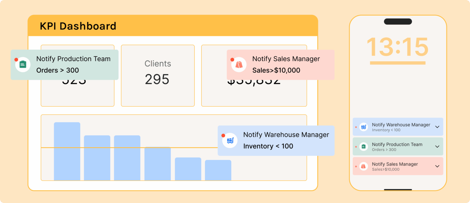
Use Alerts to Drive Escalation, Not Just Visibility
A dashboard becomes far more useful when it actively tells people when something needs attention. Static charts are helpful, but alerts are what turn a metric into a response system. For instance, if hourly output drops below 90% of target, if scrap exceeds 2% on a line, or if an action from a layered process audit remains overdue for more than 48 hours, the right people should be notified automatically. That is how a factory performance dashboard supports daily control.
The best alerts are specific, limited, and tied to standard action rules. If every small fluctuation triggers a notification, teams will ignore them within a week. But if alerts are only triggered when thresholds are breached for defined periods, they become a practical management tool. In an electronics plant, a repeated soldering defect spike could notify the line leader, process engineer, and quality supervisor, with the dashboard linking directly to the affected lot, machine, and inspection records.
This matters because response speed has a direct impact on production loss. Studies on unplanned downtime show that even short stoppages accumulate into major OEE erosion when escalation is delayed. A smart OEE dashboard should not just show availability loss after the shift ends; it should help reduce the next downtime event before it grows into a missed shipment.
Connect KPIs to Action Tracking and Continuous Improvement
The most effective dashboards do not stop at measurement. They connect abnormal performance to investigations, containment actions, Kaizen tasks, A3s, or 8D workflows. If a line repeatedly misses schedule attainment because of changeover overruns, the dashboard should help teams log the issue, assign ownership, and track closure. Otherwise, the same red KPI will appear every week with no sustained improvement.
Imagine a CI manager at an electronics plant reviewing a weekly dashboard and noticing that one SMT line has the worst minor stop frequency for four straight weeks. Instead of exporting data into another file, the manager opens a linked improvement record, assigns a team lead, and tracks corrective actions such as feeder maintenance, operator retraining, and standard work revision. The following month, minor stops fall by 22% and line OEE improves from 68% to 74%. That is a practical example of dashboard-led continuous improvement.
This is also where no-code systems can be useful. With a platform like Jodoo, manufacturers can connect forms, workflows, and dashboards in one environment, so KPI exceptions can trigger follow-up tasks automatically. That reduces the common gap between reporting and execution, especially for plants still managing CI activities through email and spreadsheets. The result is a manufacturing KPI dashboard that supports action, not just analysis.
Keep the First Version Simple and Improve It Fast
Many dashboard projects fail because teams try to build a perfect enterprise model before releasing anything to users. In reality, you are better off launching a focused first version for one line, one department, or one plant, then improving it based on real usage. Start with a narrow scope, validate the data, gather feedback from supervisors and managers, and refine the layout and thresholds. A dashboard only becomes useful after it survives actual shop floor conditions.
A good pilot might include one packaging line, one machining cell, or one final assembly area. Track a handful of high-value KPIs such as hourly attainment, downtime minutes, scrap rate, OEE, and action closure. Then ask practical questions: which charts are used in daily meetings, which metrics create confusion, and where are teams still relying on side spreadsheets. That feedback is more valuable than a long design workshop because it comes from the people responsible for performance every day.
Over time, the dashboard can expand across shifts, lines, and plants. But the operating principle should remain the same: every KPI must be trusted, timely, and tied to action. That is what separates a dashboard people ignore from a production KPI dashboard that becomes part of how the factory runs. If you want adoption, build for decisions first and visuals second.
What to Look for in Manufacturing Metrics Dashboard Software
Choosing a manufacturing KPI dashboard tool is not just a reporting decision. It is an operations decision that affects how quickly your team sees problems, responds to them, and sustains improvements. Many plants already have charts in Excel or reports in a BI tool, but that does not automatically mean they have effective manufacturing metrics dashboard software. The difference is whether the software helps you capture shop floor data, standardize KPI definitions, trigger action, and scale visibility across lines, shifts, and sites.
A good dashboard should do more than display yesterday’s numbers. It should connect production, quality, maintenance, inventory, and continuous improvement data into one usable view for supervisors, engineers, and plant leaders. If your team is running daily management, layered audits, Kaizen follow-up, or OEE review meetings, the software needs to support those workflows directly. Otherwise, your factory performance dashboard becomes another passive screen that people glance at but do not use to improve performance.
Ease of Customization Matters More Than Prebuilt Charts
Every factory tracks core metrics like output, downtime, scrap, and on-time delivery, but the logic behind those numbers varies by process. An electronics plant may need first-pass yield by SMT line and defect category, while an automotive supplier may focus on changeover time, unplanned stoppages, and customer PPM. If the system is too rigid, your team ends up forcing its process to fit the software instead of building a production KPI dashboard that reflects how the factory actually runs.
Look for software that lets your team customize forms, fields, calculations, workflows, and dashboards without waiting months for IT development. This is especially important in lean environments, where KPI structures evolve as improvement priorities change. Imagine a production manager at an automotive parts plant who wants to add a new setup reduction metric after a SMED project. If that change takes six weeks and a developer ticket, the dashboard will always lag behind the operation.
Real-Time Reporting Is Essential for Shop Floor Control
A useful manufacturing KPI dashboard should update fast enough to support decisions during the shift, not after the week is over. If downtime, scrap, or missed hourly target data only appears in a weekly report, supervisors lose the chance to intervene early. In high-mix, fast-cycle manufacturing, even a two-hour delay can mean significant lost output and overtime cost.
This is especially true for an OEE dashboard, where availability losses can escalate quickly. A report that shows machine uptime after end of shift may be fine for review, but it does not help the line leader respond to repeated micro-stops in real time. According to industry benchmarks from Vorne and other OEE practitioners, world-class OEE is often cited at 85%, yet many factories operate closer to 60%. Closing that gap requires visibility while production is still running, not after the loss is already baked in.
Mobile Data Capture Reduces Reporting Gaps
Dashboard quality depends on data quality. If operators, technicians, and quality inspectors are still recording downtime, defects, and audit findings on paper, the dashboard will always be delayed or incomplete. Good manufacturing metrics dashboard software should include mobile-friendly forms for shift reporting, inspection results, maintenance checks, and improvement actions.
For example, imagine a food manufacturing plant where line operators enter downtime reasons on a tablet at the machine, while QA logs packaging defects through a mobile form during hourly checks. That data can feed directly into a factory performance dashboard showing downtime by cause, reject trend by SKU, and open corrective actions by area. Without mobile capture, someone has to re-enter the data later, which creates delays, errors, and missing records.
Workflow Automation Turns KPIs Into Action
A dashboard that only shows red metrics is not enough. The more important question is what happens next when a KPI goes out of control. Strong software should link KPI exceptions to workflows such as escalation, task assignment, approval, CAPA follow-up, or maintenance requests.
This is where static BI tools often fall short. They are good at visualization, but they do not always handle the operational follow-through needed for lean KPI tracking. If a line’s scrap rate exceeds threshold, the system should be able to notify the right supervisor, open an investigation form, assign containment actions, and track closure status. That creates accountability and helps continuous improvement teams prove that dashboard insights are leading to measurable action.
Integration With ERP, MES, and Spreadsheets Is Non-Negotiable
Most manufacturers do not start from a clean slate. Production data may sit in MES, order data in ERP, maintenance history in CMMS, quality checks in Excel, and Kaizen tracking in shared folders. If your production KPI dashboard cannot pull from multiple sources, your team will spend more time consolidating reports than improving performance.
Look for software that can integrate with ERP, MES, spreadsheets, APIs, and existing operational systems. In many mid-sized plants, spreadsheets still hold critical data such as daily output logs or improvement registers, so practical integration matters more than ideal architecture. A dashboard platform should help you connect and standardize those data sources over time, rather than forcing an all-at-once system replacement.
Permissions and Governance Protect Data Quality
In manufacturing, not everyone should see or edit the same data. Operators may need to submit production counts, supervisors may review line-level metrics, and plant leaders may view site-wide cost and performance trends. Quality or HR-related metrics may also require tighter control. That makes role-based permissions a critical part of dashboard selection.
Governance also matters because KPI definitions can easily drift. One plant may calculate downtime differently from another, or one department may exclude rework while another includes it. Good manufacturing metrics dashboard software should support controlled data structures, audit trails, approval logic, and standardized metric definitions. This is particularly important for companies managing multiple factories or working under ISO 9001 requirements, where consistency and traceability matter.
Scalability Across Lines, Plants, and KPI Use Cases
A dashboard may start with one pilot line, but if it succeeds, the business will want to expand it. That means the software should handle increasing users, records, workflows, and dashboard views without becoming difficult to manage. It should also support different use cases beyond a single OEE dashboard, such as maintenance KPIs, quality loss trends, inventory visibility, and CI action tracking.
Scalability is not just technical capacity. It also means your team can duplicate a working dashboard structure for another line or site and adjust it quickly. For example, a regional electronics manufacturer may begin with one SMT line dashboard, then roll out the same framework across test, assembly, and packaging operations. If each rollout requires custom coding, expansion becomes slow and expensive.
Static BI Tools vs. Flexible Manufacturing Dashboard Platforms
Traditional BI tools are useful for analysis, executive reporting, and historical trends. But many of them were not built for shop floor data capture, workflow automation, or day-to-day operational management. They often depend on clean upstream data and specialist support, which limits their usefulness in fast-moving plant environments.
Flexible manufacturing metrics dashboard software is different because it combines data collection, dashboards, alerts, workflows, and permissions in one environment. That matters for lean KPI tracking, where the goal is not only to measure but to sustain action. If your plant runs daily tier meetings, tracks open Kaizen actions, manages layered process audits, or follows up on recurring downtime, you need software that supports the full loop from signal to response to closure.
What Good Evaluation Looks Like
When comparing options, ask practical questions instead of focusing only on chart appearance. Can supervisors update KPI definitions without coding? Can operators submit downtime reasons from mobile devices? Can the system trigger follow-up actions when a metric crosses threshold? Can you combine ERP order data, MES production data, and manual quality logs into one factory performance dashboard?
How Jodoo Helps Manufacturers Build a Smarter OEE Dashboard and KPI Workflow System
A manufacturing KPI dashboard only works when the data behind it is timely, accurate, and tied to daily shop floor action. In many plants, that is where the problem starts. Production output sits in one spreadsheet, downtime logs are written on paper, quality defects are tracked in a separate file, and maintenance teams update work orders in WhatsApp or email. The result is a dashboard that looks complete in a meeting, but does not help supervisors respond fast enough during the shift.
Jodoo solves this by combining no-code app building, digital forms, workflow automation, and role-based dashboards in one platform. Instead of asking IT to develop a custom system or forcing operations teams to adapt to rigid software, you can build a factory performance dashboard around the way your plant already works. That matters in manufacturing, where each site may have different lines, shift structures, approval rules, and reporting needs across production, quality, maintenance, and inventory.
Build The Data Collection Layer First, Not Just The Dashboard
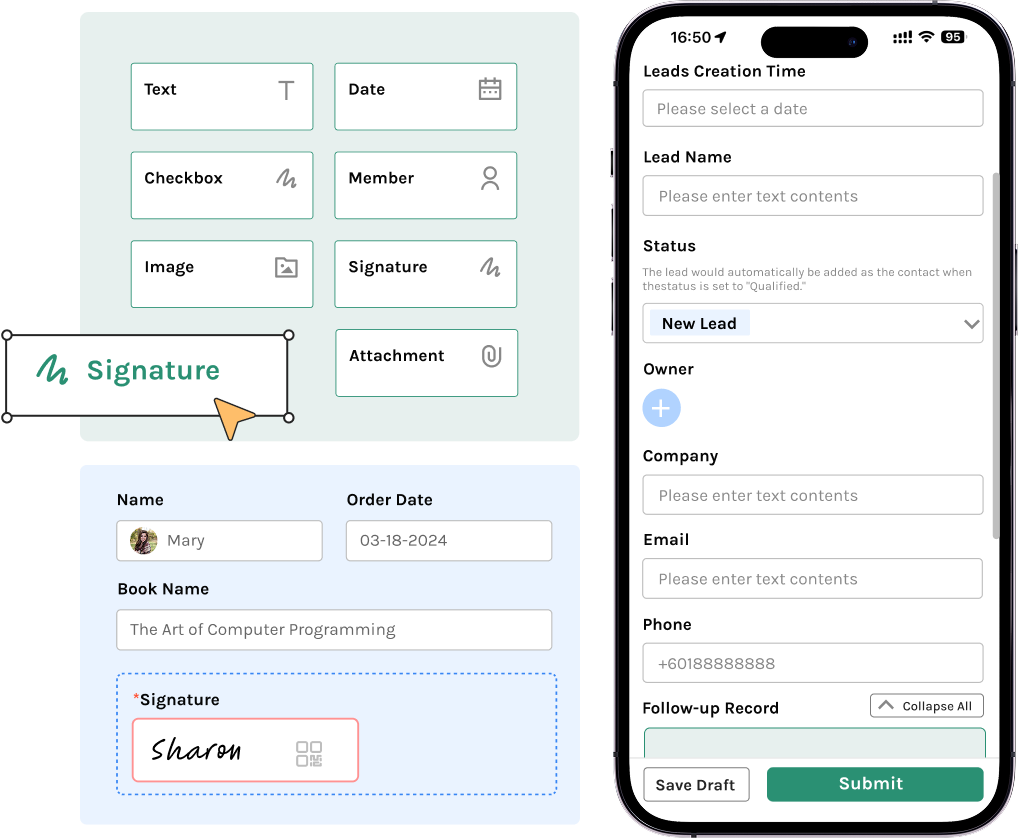
A strong production KPI dashboard starts with structured data capture at the source. With Jodoo, you can create digital forms for hourly production reporting, downtime logging, defect recording, material issuance, changeover checks, LPA findings, and maintenance inspections. Operators and supervisors can enter data from mobile devices or shop floor terminals, with required fields, dropdown lists, photo attachments, timestamps, and QR or barcode scanning where needed.
This approach reduces one of the biggest causes of unreliable KPI reporting: inconsistent manual entry. If one line records “machine stop,” another writes “breakdown,” and a third leaves the field blank, your OEE dashboard becomes difficult to trust. Standardized forms help enforce common definitions for availability loss, performance loss, and quality loss, which is essential because OEE is only useful when the calculation logic is consistent across shifts and lines.
Connect Production, Quality, Maintenance, And Inventory In One Workflow
Most plants do not struggle because they lack metrics. They struggle because the metrics are disconnected from the processes that improve them. Jodoo lets you connect data capture to workflows, so when a downtime event exceeds a threshold, a maintenance task can be triggered automatically, or when scrap rises above target, a quality review can be assigned to the right engineer. That turns a passive manufacturing metrics dashboard software setup into an active operating system for daily management.
Imagine a production manager at an automotive parts plant who runs six CNC machining lines across three shifts. Every time a machine stops for more than 10 minutes, the line leader logs the reason in a Jodoo form, attaches a photo if needed, and submits it from a tablet at the line. A workflow then routes the issue to maintenance if the root cause is equipment-related, to quality if it involves tooling wear or dimensional defects, and to production planning if the stoppage affects delivery risk. The dashboard updates in real time, so the manager can see downtime by line, top loss reasons, open actions, and estimated output recovery before the next shift review.
Create Role-Based Dashboards For Different Decisions
Not every user needs the same view of the plant. A line supervisor needs live output versus plan, stoppage minutes, first-pass yield, and operator attendance. An operations director is more likely to focus on site-level OEE trends, schedule adherence, scrap cost, maintenance backlog, and inventory risk. Jodoo supports role-based access, so you can create different dashboard views without exposing unnecessary data across departments.
This is especially important for multi-site manufacturers or suppliers working with strict compliance requirements. For example, an electronics assembly plant may want one factory performance dashboard for production teams, another for quality engineers tracking defect Pareto and rework rates, and a third for senior leaders reviewing OEE, on-time delivery, and cost of poor quality. Because the dashboards pull from the same underlying records and workflows, everyone works from the same source of truth instead of debating whose spreadsheet is correct.
Support Lean KPI Tracking Beyond OEE
OEE is important, but it is not enough on its own. Plants that are serious about continuous improvement also need lean KPI tracking for action closure, audit compliance, recurring losses, and process discipline. Jodoo can bring those operational and CI metrics into the same environment, so your dashboard does not stop at “what happened” but also shows “what is being done about it.”
For example, you can track open Kaizen actions, LPA completion rate, repeat defect frequency, mean time to repair, changeover duration, and overdue CAPA tasks alongside output, scrap, and downtime. If a food manufacturing plant sees frequent unplanned stops on packaging lines, the dashboard can highlight not only the downtime trend but also whether corrective actions from previous RCA meetings were completed on time. That creates accountability, which is often the missing link between review meetings and actual performance improvement.
A Practical Use Case: From Paper Logs To A Live OEE Dashboard
Consider a mid-sized food and beverage manufacturer with four packaging lines. Before digitization, operators recorded hourly output on paper, maintenance logged breakdowns in Excel, and quality defects were summarized at the end of each shift. By the time the operations manager reviewed performance, the data was already several hours old, and recurring small stops were hidden inside vague downtime categories.
Using Jodoo, the plant built digital production forms, downtime logs, defect capture forms, and maintenance response workflows in a few weeks without heavy custom development. The team then created an OEE dashboard showing availability, performance, and quality by line and shift, plus a production KPI dashboard for plan versus actual output, scrap rate, and top three downtime reasons. Supervisors could drill down from the summary chart into the underlying stoppage records, see which issues were still open, and follow action status directly from the same system.
In practice, this kind of setup helps plants respond faster to daily losses. Industry research often shows that unplanned downtime can cost manufacturers thousands of dollars per hour, with the impact varying widely by sector and process criticality. Even modest improvements matter: if a line running at 68% OEE improves to 75%, that can translate into meaningful capacity gains without new capital expenditure, especially in high-volume environments like packaging, electronics assembly, or stamping operations.
Build Faster Without Waiting On IT
One of the biggest advantages of Jodoo is speed. Operations teams can configure forms, workflows, and dashboard logic without waiting through a long software development cycle. That is useful when KPI definitions change, when you add a new line, or when a site wants to test a different escalation rule for downtime, scrap, or maintenance response.
Instead of launching a large MES replacement project, many manufacturers start smaller. They build one manufacturing KPI dashboard for a critical line or one department, validate the data, standardize the workflow, and then expand to other lines or plants. This phased approach reduces risk and helps teams prove ROI early, which is often what operations directors need before scaling a digital initiative.
Why This Matters For Daily Factory Management
A dashboard alone does not improve performance. What improves performance is a system where data capture, action management, and visual reporting are connected tightly enough to support daily decisions. Jodoo helps manufacturers build that system by turning isolated reports into an operational workflow that links production losses to response, ownership, and follow-up.
Conclusion: Build a Manufacturing KPI Dashboard That Drives Action, Not Just Reporting
A strong manufacturing KPI dashboard does more than display charts on a screen. It gives plant leaders a real-time view of what is happening on the shop floor, highlights where performance is drifting, and makes it clear who needs to act next. Whether you are tracking OEE, scrap rate, downtime, on-time delivery, or open corrective actions, the goal is the same: turn data into faster decisions and sustained process improvement.
In practice, the best dashboards are built around a few critical rules. Focus on KPIs that operators, supervisors, and managers can influence directly, connect each metric to a clear owner, and update data frequently enough to support daily management. Imagine a production manager at an electronics plant who can immediately see rising first-pass yield losses on one line and trigger containment before it affects customer shipments. That is where a dashboard stops being a reporting tool and becomes an operational control system.
If you want to build a more flexible manufacturing KPI dashboard, Jodoo can help. As a no-code lean manufacturing platform, Jodoo lets you create custom forms, workflows, and dashboards to modernize KPI tracking without heavy development. You can start a free trial or book a demo to see how it fits your factory.